Every product has one screen that nobody designed and everybody dreads.
It started simple. A few preferences. A toggle for notifications, a field for the display name, a button to change the password. Clean, manageable, fine. Then the product grew, and every new feature that needed a configuration option put it there. The integration settings went in. The billing section went in. The team management. The API keys. The notification preferences multiplied from one toggle to forty. The privacy controls. The advanced options nobody understands. The legacy settings that control features that don't exist anymore but can't be removed because someone might be using them.
By the time the product is mature, the settings page is an archaeological dig — layer upon layer of configuration added by different people at different times with different mental models, accumulated into a screen that no single person understands and that users navigate with a mixture of confusion and dread. The settings page is where products go to die, and the state of a product's settings is one of the most honest indicators of its design health.
Why Settings Pages Decay
Settings pages decay for a structural reason: they're the default destination for any configuration option, and nothing ever gets removed.
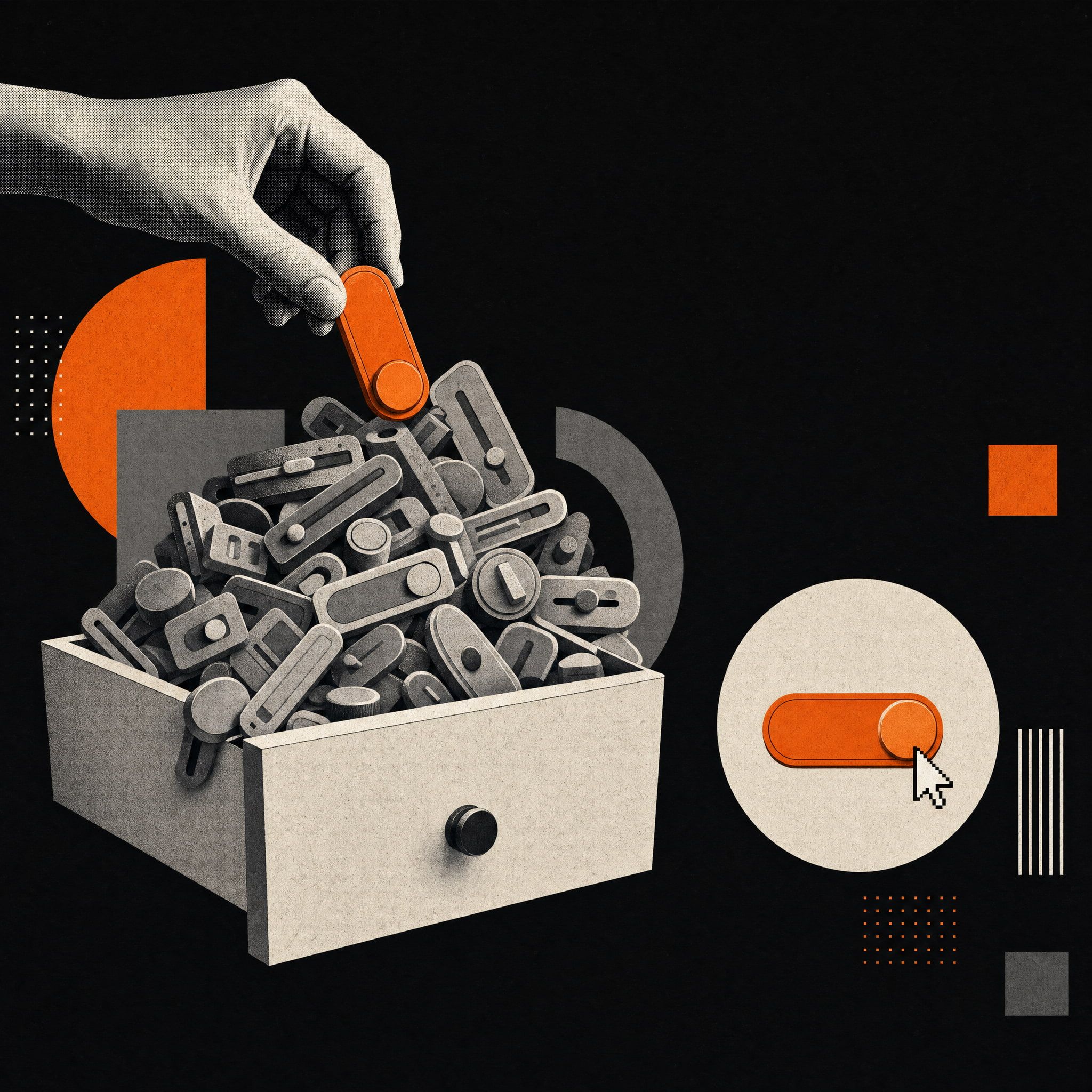
When a feature needs a setting, the setting goes in the settings page. This is the path of least resistance — there's already a settings page, it already holds settings, so the new setting goes there. No one stops to consider whether the settings page can absorb another option without becoming worse, because each individual addition is small and the degradation is gradual. The settings page accumulates options the way a junk drawer accumulates objects: one reasonable addition at a time, until the whole is unusable.
Removal almost never happens. A setting, once added, is nearly impossible to remove, because removing it might break someone's workflow. Even a setting that 0.1% of users have changed represents real users who would be affected by its removal, and the cost of disrupting them feels more concrete than the diffuse cost of the settings page being slightly more cluttered. So settings accumulate monotonically — always added, never removed — and the settings page grows without bound.
The people adding settings are also usually not thinking about the settings page as a whole. A team shipping a new feature adds the settings their feature needs, considering those settings in the context of their feature rather than in the context of the entire settings experience. They make a locally reasonable decision — these settings belong here, organized this way — without visibility into how their addition interacts with the hundred other settings added by other teams with other local logic. The settings page becomes the sum of many local decisions, with no one responsible for the global coherence.
And settings pages get the least design attention of any surface in the product, because they're considered utilitarian. Settings are where users go to configure things, the thinking goes, not an experience that needs to be good, just functional. This relegation to utility means the settings page is rarely in a design review, rarely tested with users, rarely considered as a holistic experience. It's plumbing, and plumbing gets neglected until it leaks.
What the Settings Page Reveals
The state of a product's settings page is diagnostic. It reveals things about the product's design discipline that are harder to see in the more polished, more attended surfaces.
A coherent, well-organized settings page reveals a team that maintains its product holistically — that doesn't just ship features but integrates them, that has someone responsible for the coherence of the whole, that treats even the utilitarian surfaces as worth getting right. This kind of settings page is rare, and its existence signals an unusual level of design discipline.
A chaotic settings page reveals the opposite: a team that ships features without integrating them, that has no one responsible for global coherence, that treats the unglamorous surfaces as beneath attention. The settings page is where this lack of discipline becomes visible, because it's the surface where the accumulated consequences of many uncoordinated decisions pile up most directly. A product can have a beautiful homepage and a beautiful core flow and still reveal, in its settings page, that its underlying design discipline is weak.
This is why the settings page is worth examining when evaluating a product's design maturity. The polished surfaces show what the team can do when they're paying attention. The settings page shows what happens when they're not — and what happens when they're not is a more honest indicator of the team's actual design discipline than what happens when they are. A team that gets the settings page right is a team that gets things right even when no one is watching, which is the truest test of design discipline there is.
The Cost of a Bad Settings Page
The neglect of settings pages would be defensible if settings pages didn't matter. They do, in several ways that are easy to underestimate.
Settings are where users go when they have a problem. The user whose notifications are too frequent goes to settings to reduce them. The user who needs to add a teammate goes to settings to do it. The user who wants to change their plan goes to settings to manage billing. These are often moments of mild frustration or important action, and a settings page that makes them hard compounds the frustration or blocks the action. A user who can't find how to reduce their notifications might instead reduce their usage of the product, or leave. A user who can't figure out how to add a teammate doesn't expand their account. The settings page being bad has direct consequences for retention and expansion, because it's where users go to solve the problems that, unsolved, drive them away.
Settings are also where users go to cancel, and a settings page designed to make cancellation hard is a specific and increasingly scrutinized dark pattern. But beyond the ethics, a settings page so confusing that users can't accomplish legitimate tasks creates support load — every user who can't find a setting and contacts support is a cost, multiplied across every confusing setting and every user who encounters it. The support tickets generated by a bad settings page are a direct, measurable cost of its badness.
And the settings page shapes the overall impression of the product's quality. A user who experiences a polished product and then hits a chaotic settings page experiences the dissonance, and the dissonance erodes their sense that the product is well-made. The settings page is part of the product, and its quality contributes to the cumulative impression of whether the product is the kind of thing made by people who care.
Designing Settings That Scale
The alternative to settings page decay is designing settings as a system that can absorb growth without degrading — which requires treating settings as a real design problem rather than a default destination.
Organize by user mental model, not by feature. The most common settings page failure is organization that reflects the product's internal structure rather than how users think. Settings grouped by which team built them, or which feature they belong to, force users to understand the product's architecture to find what they need. Settings grouped by what the user is trying to accomplish — account, notifications, privacy, billing, team — match how users think about configuration and make settings findable without architectural knowledge.
Make settings searchable. Beyond a certain number of settings, organization alone isn't enough — users need to be able to search. A settings page with search lets a user who knows what they want to change find it directly, without navigating the organizational hierarchy. For products with many settings, search transforms the settings experience from navigation-based to query-based, which scales far better as settings accumulate.
Surface settings in context. Many settings don't need to live only in the settings page. A setting that controls a specific feature can be accessible from that feature, in the context where the user is thinking about it, rather than requiring a trip to a central settings page. Contextual settings reduce the load on the central settings page and put configuration where it's most relevant. The notification setting accessible from the notification, the privacy setting accessible from the thing being made private — these contextual placements often serve users better than central aggregation.
Establish defaults that work. The best setting is the one the user never has to change because the default is right. A product with thoughtful defaults reduces the number of settings users need to engage with, which reduces the load on the settings page and the cognitive burden on users. Every setting that has a genuinely good default is a setting most users will never touch, which means the settings page can be designed for the minority who need to change things rather than burdening everyone with options they don't need.
Govern settings actively. The decay of settings pages comes from the absence of governance — no one responsible for the coherence of the whole. The fix is to assign that responsibility: someone who reviews settings additions against the whole, who pushes back on settings that don't need to exist, who periodically audits the settings page for options that can be removed, consolidated, or relocated. Active governance is what prevents the monotonic accumulation that turns settings pages into archaeological digs.
The Audit Worth Doing
For a product whose settings page has already decayed, the remedy is a settings audit — a deliberate examination of the entire settings experience with an eye toward simplification.
The audit asks, for every setting: does this need to exist? Many settings were added to handle a case that no longer applies, or to provide flexibility that no one uses, or to avoid making a decision that could have been made. A setting that almost no one changes might be better as a fixed default, with the rare user who needs it accommodated some other way. The audit identifies settings that can be removed entirely, which is the most valuable outcome because removal is what reverses the accumulation.
For settings that need to exist, the audit asks: is this in the right place, organized the right way, named clearly? Settings accumulated over time often end up in locations that made sense when they were added but don't fit the current structure. Reorganizing them around the current user mental model, renaming them for clarity, and relocating contextual settings to their relevant features improves the experience without removing functionality.
The settings audit is not glamorous work. It produces no new features, no visible additions, nothing to announce. It's pure simplification — making the product better by making part of it smaller and clearer. But it's some of the highest-leverage maintenance a mature product can do, because the settings page is where the accumulated entropy of the product concentrates, and clearing that entropy improves the experience at exactly the point where users go to solve their problems.
The Discipline the Settings Page Demands
Ultimately, the settings page is a test of a discipline that's hard to maintain: the discipline of caring about the whole product, not just the parts that get attention.
It's easy to make the homepage good — it's visible, it matters obviously, everyone looks at it. It's hard to make the settings page good, because nothing forces the issue. No one demands it. It doesn't show up in demos. It's not where the design energy naturally goes. Making the settings page good requires a team that extends its care to the surfaces that don't demand it, that treats the unglamorous parts of the product as worth getting right, that maintains coherence even where no one is watching.
This discipline is rare, and its rarity is why the settings page is such a good diagnostic. A team that has it produces products that are good all the way through — coherent in their settings as in their core flows, cared for in their utilities as in their features. A team that lacks it produces products that are good where the attention went and decayed where it didn't, with the settings page as the clearest evidence of the gap. The settings page is where products go to die. It's also where the products that don't die reveal that someone cared enough to keep even this alive.