Where they started
Customerly is a bootstrapped company that has been shipping for years, with real revenue and tens of thousands of businesses on the platform. That history shows up in the product as depth, which is the good version of a long roadmap. It also showed up on the website as a list.
A first time visitor landed on a page describing AI agents, automated workflows, survey tooling and email marketing. All true, all valuable, none of it adding up to a sentence the visitor could repeat to a colleague. Breadth read as this does a lot of things rather than this solves my thing, and the gap between those two readings is most of the conversion rate.
There was also a trust problem specific to the AI category. Everyone now claims an AI agent. Claiming it louder does not work, because visitors have learned to discount the claim. The only thing that moves someone is watching the thing behave.
What we did
Three promises, then a layout
We started with the story rather than the layout. Everything the product does got compressed into three promises: faster resolutions, happier customers, and AI that works like a real teammate rather than a deflection layer between a customer and a human. Every section on the site then had to earn its place against one of those three, and a lot of accurate copy got cut for failing that test.
A product-first design system
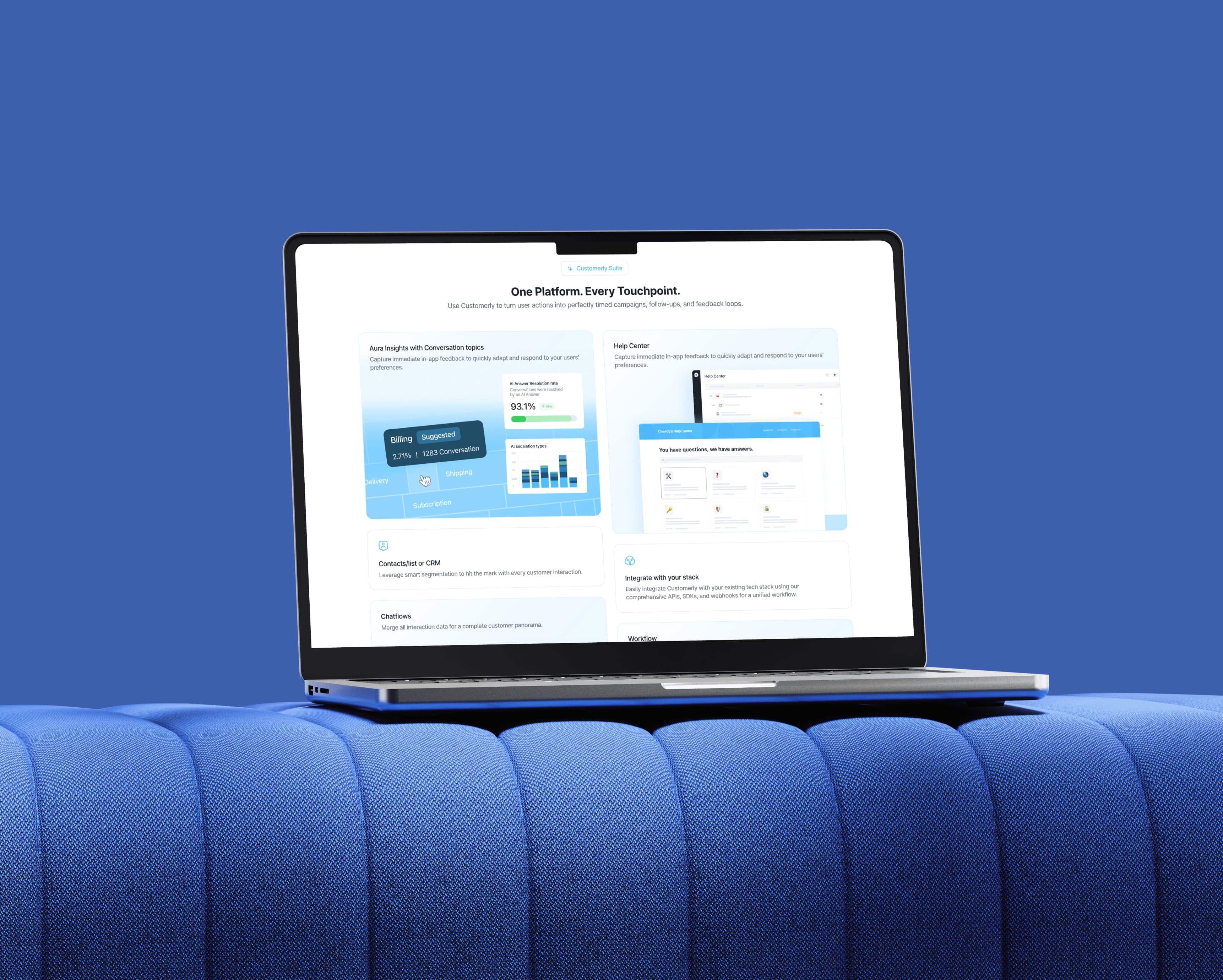
The design system went high contrast and product first. Bold highlights pulling attention to the numbers that matter, real product surfaces instead of decorative abstraction, and customer results treated as primary content rather than a logo strip near the footer. Clean layouts, because the product itself is dense and the site should not compete with it for attention.
Animations that show the mechanism
A support platform is mostly invisible. A conversation comes in, something reasons about it, a resolution goes out, and a screenshot of that is a chat window that looks like every other chat window. So we built short 2D pieces that show the mechanism instead. A conversation arriving and being resolved without a human touching it. A workflow branching. A survey response turning into a signal the team can act on. Each one short, silent, loopable, and sitting next to the claim it is proving.
A component library, not a handoff
We built the whole site in Webflow on a custom component library, and that was a long term decision rather than a shortcut. Customerly ships fast and launches campaigns constantly. A site that needs us for every new page becomes a bottleneck within a month. Their team now assembles new pages from components that already match the system, without a designer in the loop and without the site drifting.
The result
The site stopped listing features and started making an argument. A visitor arrives, reads one promise, watches thirty seconds of the product actually doing it, and sees results from businesses like theirs, in that order. The animations carry the explanation that used to be attempted in paragraphs, which is why the page got shorter and clearer at the same time.
The component library did the quieter thing. Customerly's team launches pages on their own schedule now, and the visual system holds across all of them.