The brief and the trap
Vibecoder is an AI powered no-code platform that lets creators launch professional websites without technical barriers. Its category is launching new competitors constantly, and they have converged on the same visual language: purple gradients, glow, a floating prompt box, the word magic. A new entrant that looks like that is invisible by default, because the aesthetic now reads as category wallpaper rather than as a company.
The trap on the other side is overcorrecting into cold and technical. Vibecoder's whole point is that non-technical people can use it. An identity that signals developer tool would have contradicted the product to exactly the audience it needs. So the brief had two constraints pulling against each other: modern and trustworthy without becoming complex or cold, fast and innovative without becoming another glowing gradient.
What we did
Three colours, no gradients
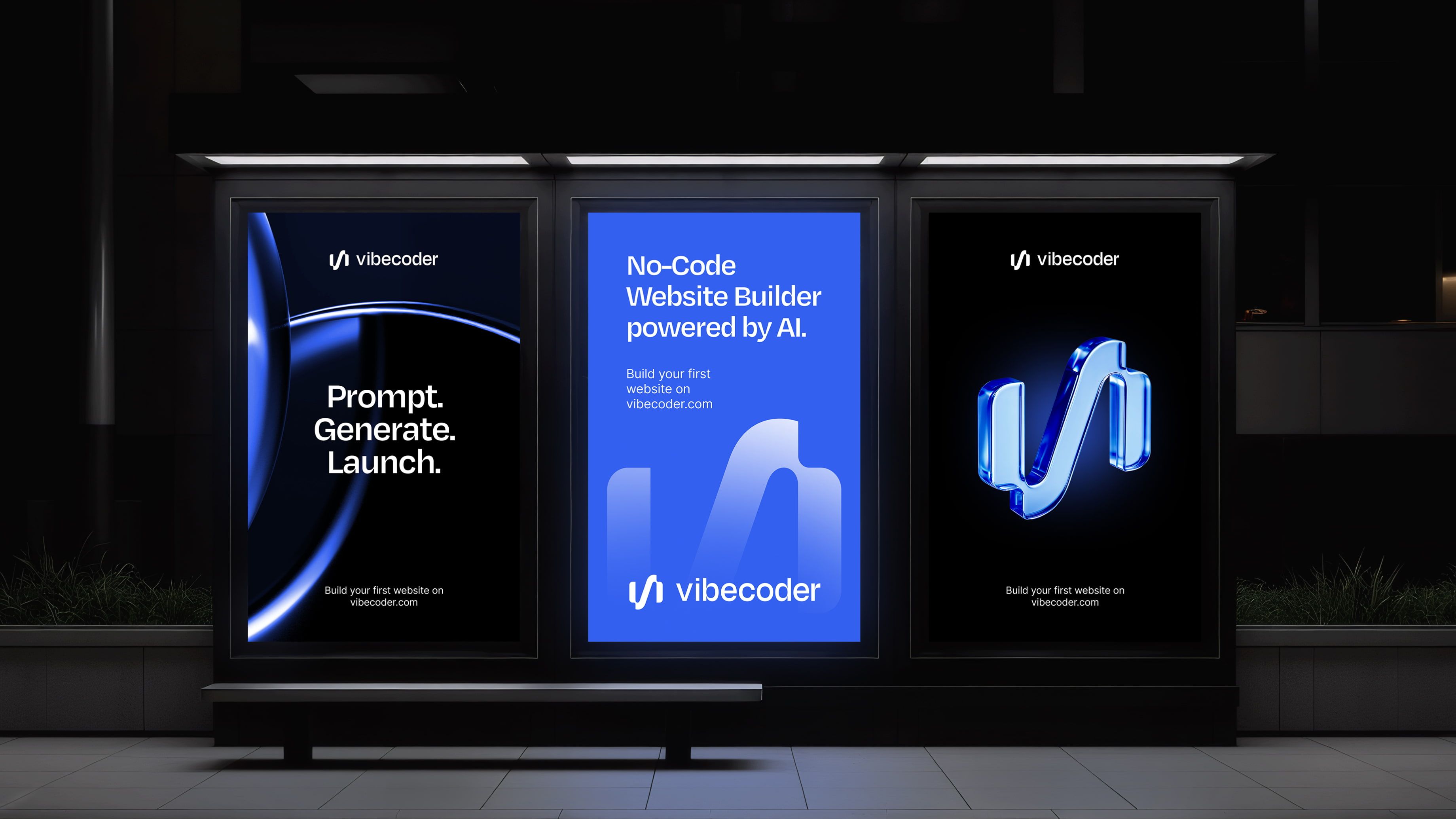
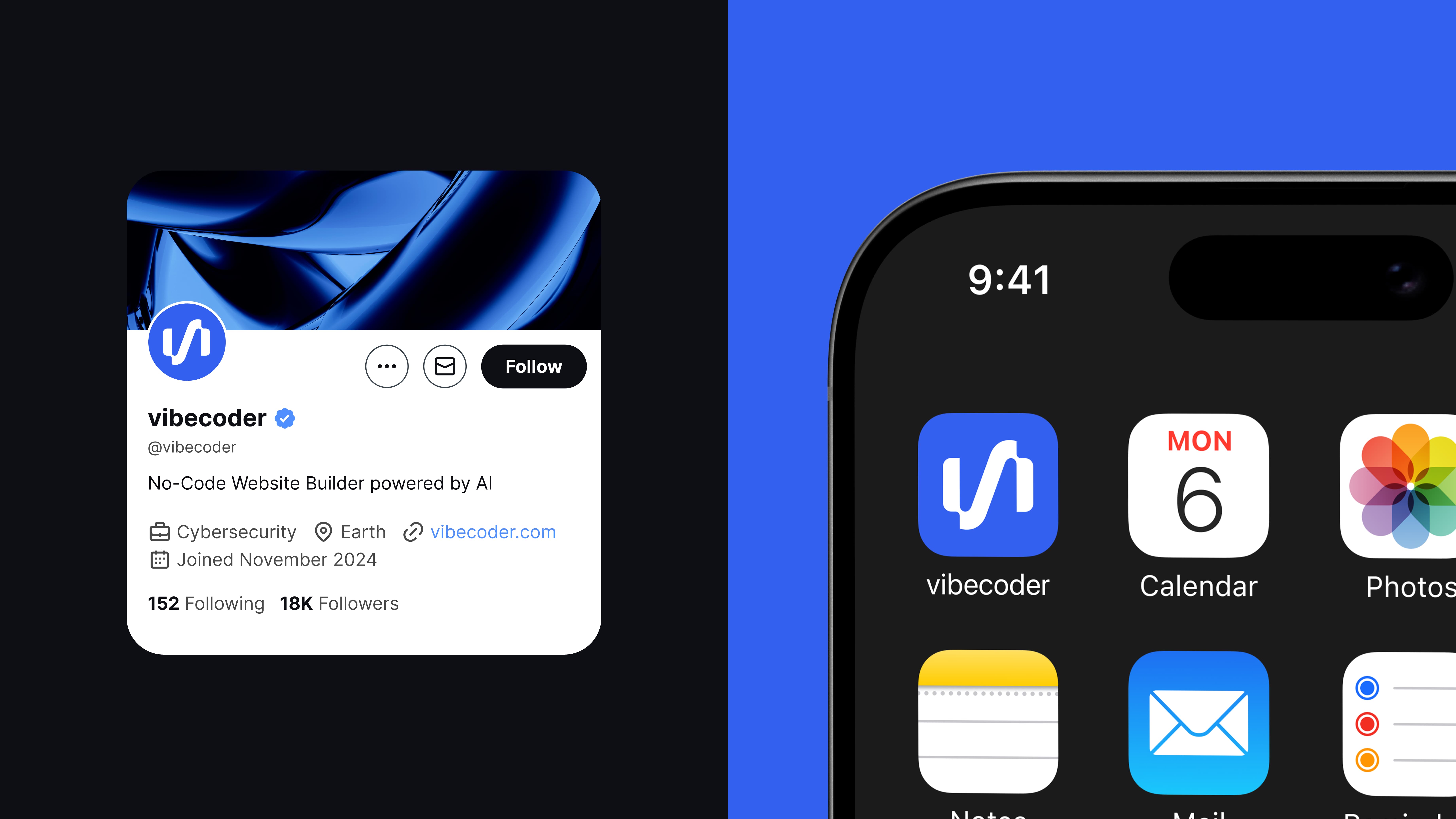
The palette went to black, blue and white and stopped there. Black for strength and authority, because a tool that builds your public website has to feel like it will not embarrass you. Blue for innovation and trust, which is the one thing the category actually gets right. White for balance and breathing space, which is where the friendliness comes from rather than from colour tricks. Three colours, and it stands out in a category that has collectively agreed to look the same.
Degular for the dual register
Degular carried the type. Open forms and balanced proportions with rounded detail, so it reads precise at interface scale and warm at headline scale. That dual register is the positioning expressed in a typeface: technologically advanced, genuinely accessible.
A system small enough to use
We kept the system deliberately small. A pre-launch team does not need a ninety page brand book, it needs a kit that survives being used by a founder at midnight. The marks, the type scale, the colour rules, and a short set of do and do not examples.
A film that moves at the speed of the claim
Motion was built around the product's core message: prompt, generate, launch. Rather than asserting that it is fast, the film shows the actual sequence at the speed it happens, so the pacing carries the claim. Nothing needs a voiceover explaining that this is easy, because the audience watched it be easy.
The result
Vibecoder launched with an identity that does not look like its category and a film that explains the product in the time it takes to scroll past it. Product, site and film all came from one visual world rather than being reconciled afterwards.