NOTES
What we learn between launches
Notes from making launch videos and brands for funded AI startups. What things cost, how the work gets made, and what holds up on launch day.
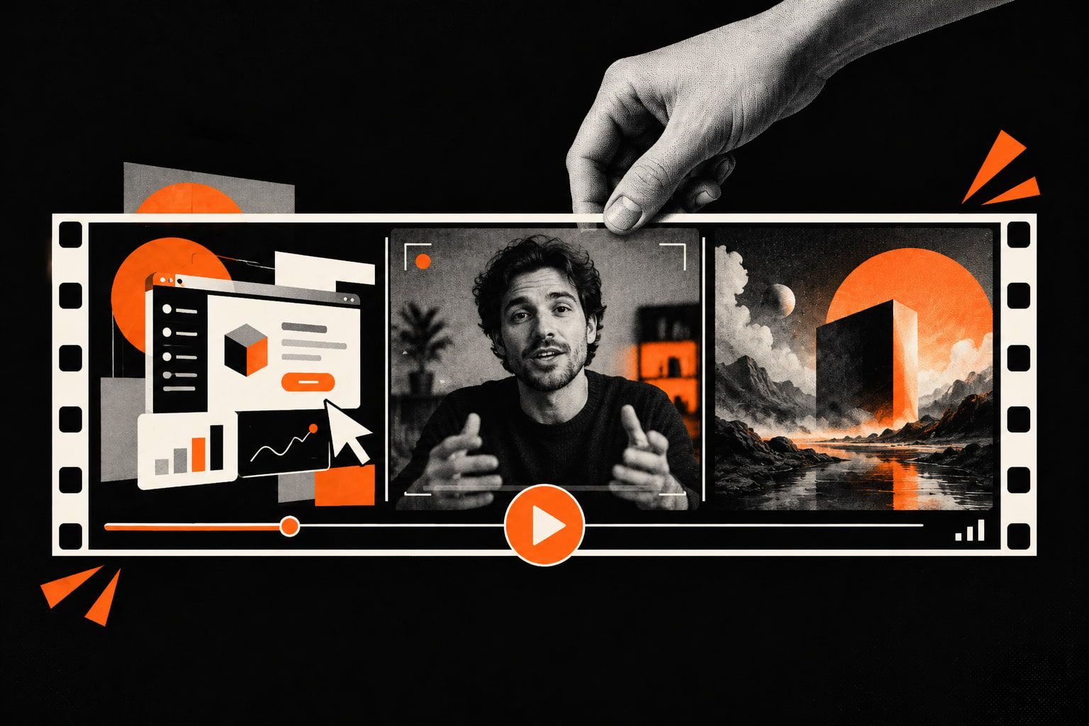
Animated, filmed or AI-made? When each one fits a launch video, where AI footage works, and why a fully AI-made video rarely does the job.
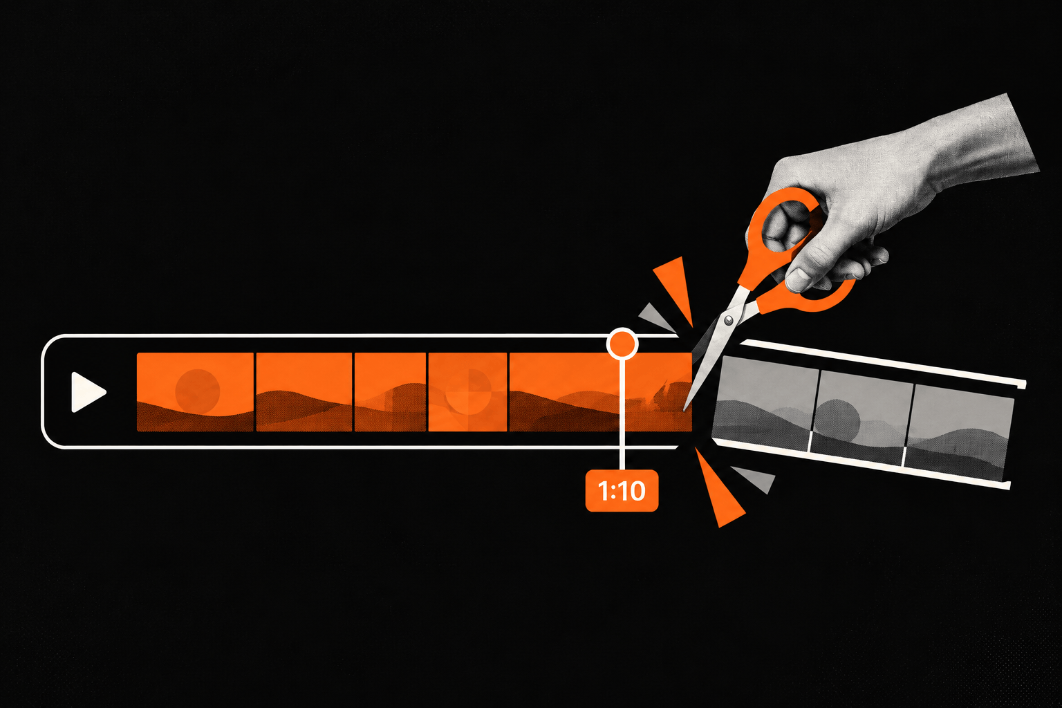
Around 70 seconds is best for a product launch, 40-45 for a feature. What makes a video slow, how to split the time, and how to stop it from growing.

Seven launch videos worth studying, what the best ones have in common, and how to use examples when you brief a studio.

Why a video helps you stand out on Product Hunt, how to structure it, and why you don't need a separate one.

Why a funding round deserves a video, what it should say, and how to plan one when the round is secret until the day.

What drives the price of a launch video, what you get at each level, and how to budget for one without wasting it.

Booth screens are silent, and people walk up at random moments. What a booth video needs to work: 45-70 seconds, every key point on screen, and no weak parts.
The founding designer who was extraordinary at six people is a bottleneck at sixty. The systems designer hired into a pre-PMF startup hasn't moved the product in six months. Both are excellent. Nothing about them changed — the job did.
The person who set everything up left the company. Someone else has their seat, a fully configured account they didn't build, and automations nobody can explain. They're a new user in every way that matters — and your product doesn't think so.
Watch someone use an unlabeled toolbar and you'll see them hover over each icon, waiting for tooltips — reading the words the icons were supposed to replace. Icons are assumed to be universally understood. About a dozen of them actually are.
A button sized perfectly around the word "Settings" has already failed in German. Localization readiness isn't a translation problem — it's a layout, typography, and component architecture problem, and every fix is cheap early and expensive later.
The contract gets signed, accounts get provisioned, and two months later usage has collapsed. In B2B, the buyer and the daily user are different people with opposing needs — and most products are designed for whichever one the company is currently more afraid of losing.
Somewhere in your product there is a thing called a Workspace. Nobody decided it would be called that — an engineer needed a container object and the name stuck. Naming is one of the highest-leverage design decisions in a product, and almost nobody treats it as one.
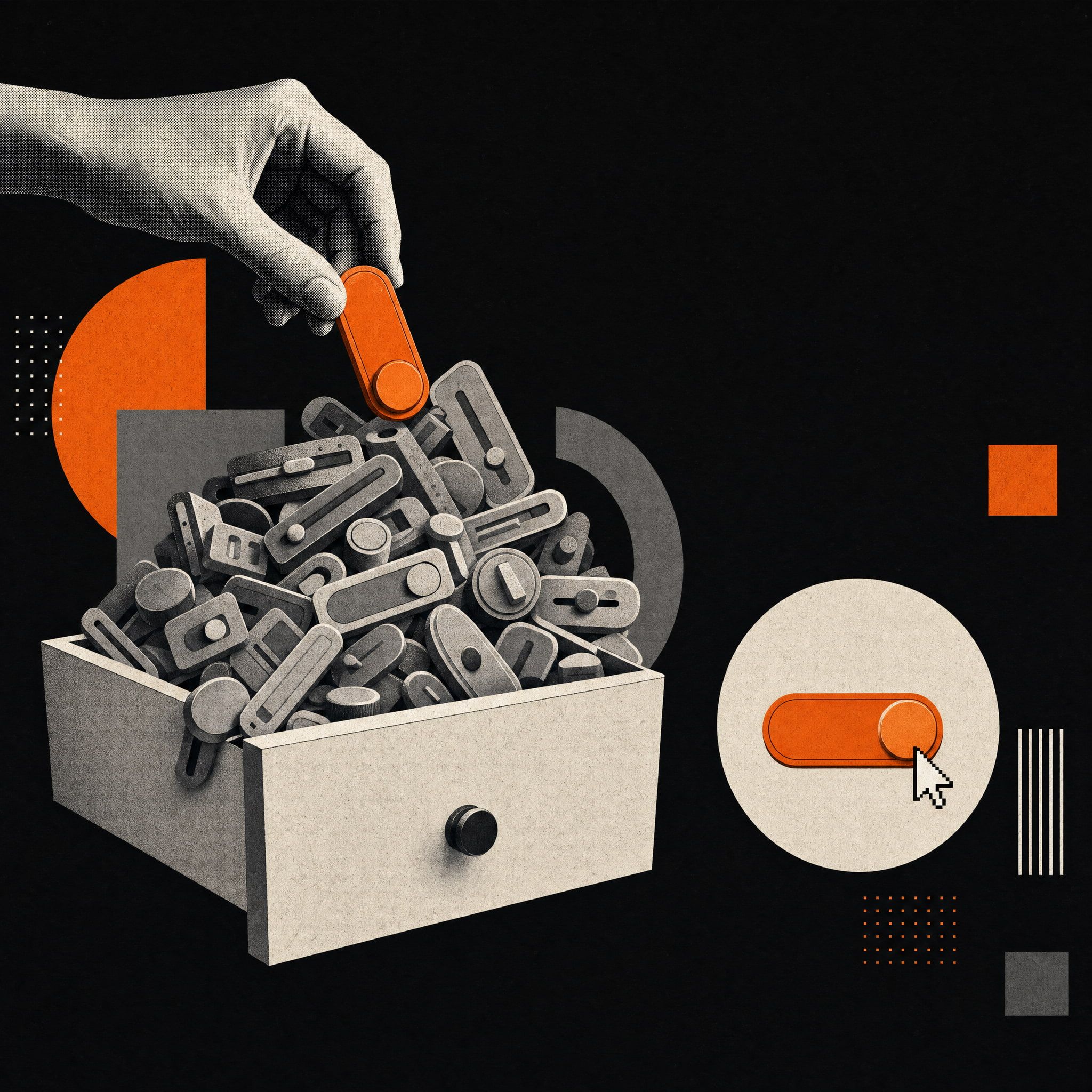
Every product has one screen nobody designed and everybody dreads. The settings page accumulates options like a junk drawer until no one understands it — and its state is one of the most honest indicators of a product's design discipline. Here's how to keep it alive.
When a product handles money, data, or irreversible actions, the thing it's really selling is trust — built and destroyed through design decisions most teams never examine. Here's how calibrated friction, honest microcopy, and transparency keep users feeling safe.
Open ten startup sites in a row and they blur together. Templates encode real wisdom — and have produced a web where differentiation is nearly impossible. Here's how the sameness happened, what it costs, and where real differentiation actually lives.
Your most engaged users respond to surveys, attend beta programs, and have direct lines to your product team. They're invaluable. They're also a tiny fraction of your users — and designing around their feedback is quietly making your product harder for everyone else.
Mobile-first became an ideology. For B2B SaaS products where most usage happens on a desktop, that ideology is producing worse products. Here's what happens when methodology overrides behavior — and what to do instead.
At five people, brand consistency is free — everyone absorbed it through proximity. At fifty, it isn't. Here's how brand coherence quietly breaks down as teams grow, and what to build before the damage becomes expensive to fix.
The demo looked polished. The product looked different. Most SaaS companies are running two parallel experiences without realizing it — and the gap between them is where early churn quietly begins.
The green looked perfect on screen. Then the printer couldn't match it, the trade show materials came back wrong, and the reprints added up. Brand color is not one decision — it's four. Most studios only address one of them.
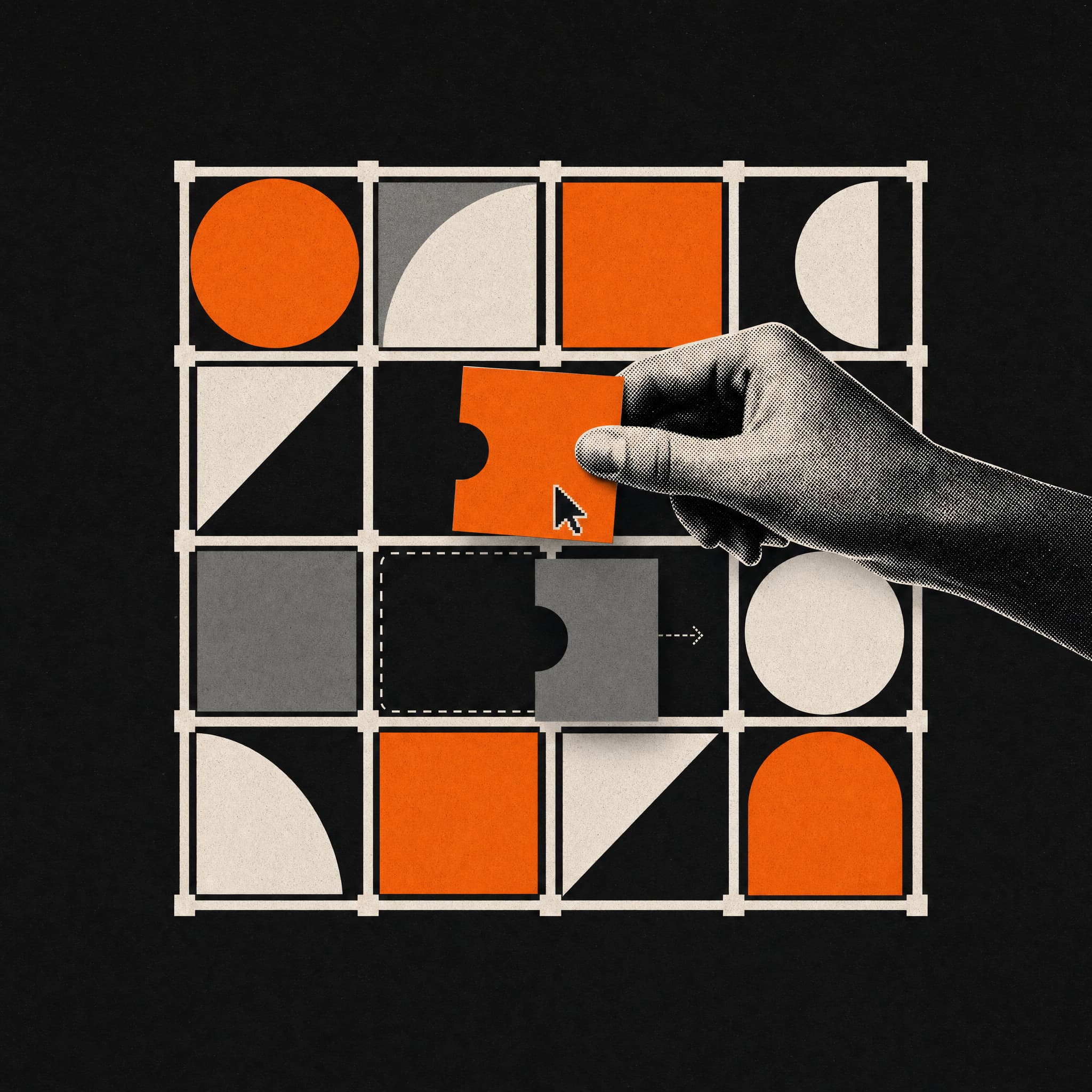
Around week six, the founder says: "Our positioning has shifted a bit." Most design processes treat this as a problem. The ones that don't build something far more valuable — and far more durable.
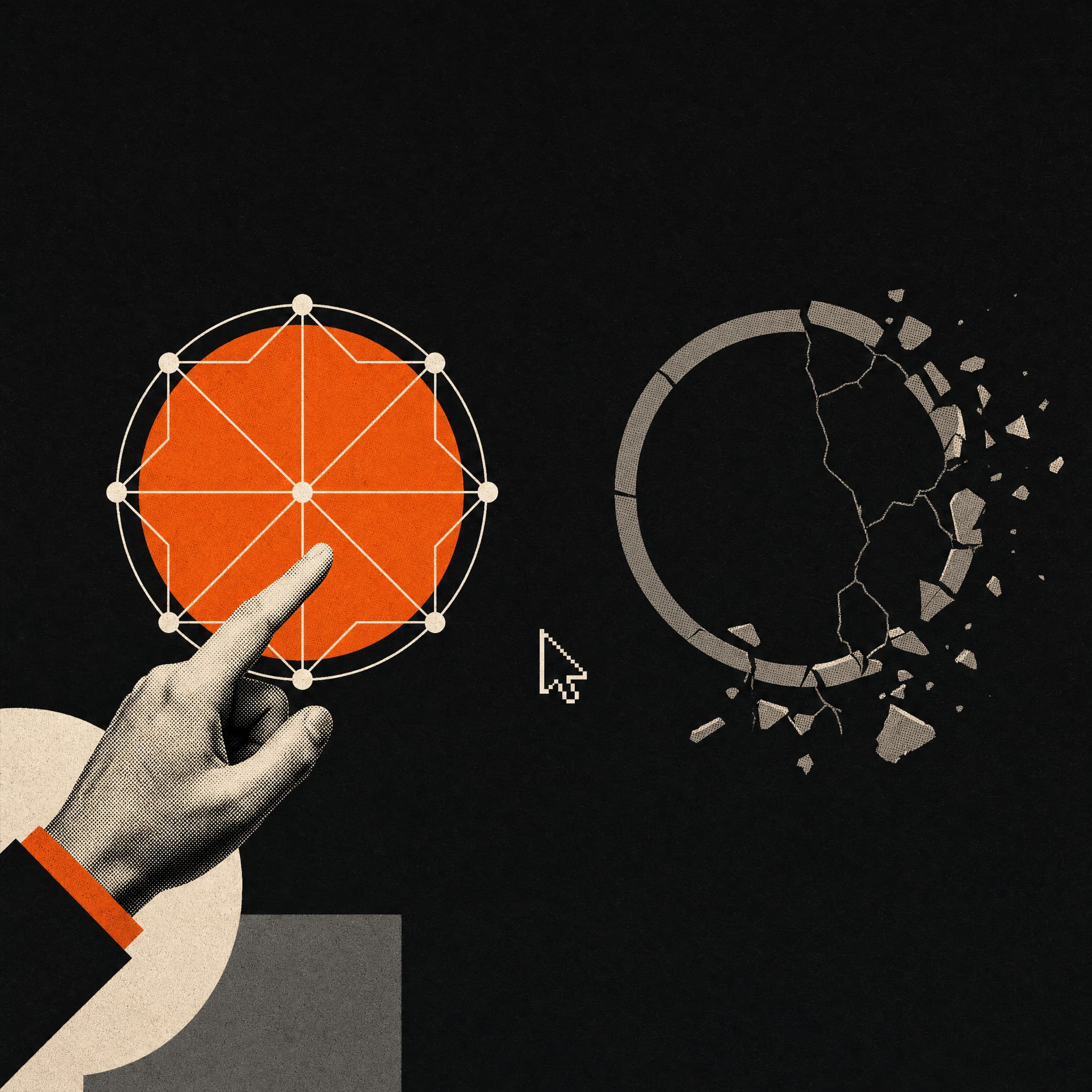
Hundreds of SaaS products have tried to copy Stripe's restraint and Linear's precision. Most ended up with the aesthetic and none of the intelligence. The difference isn't visual — it's systemic.
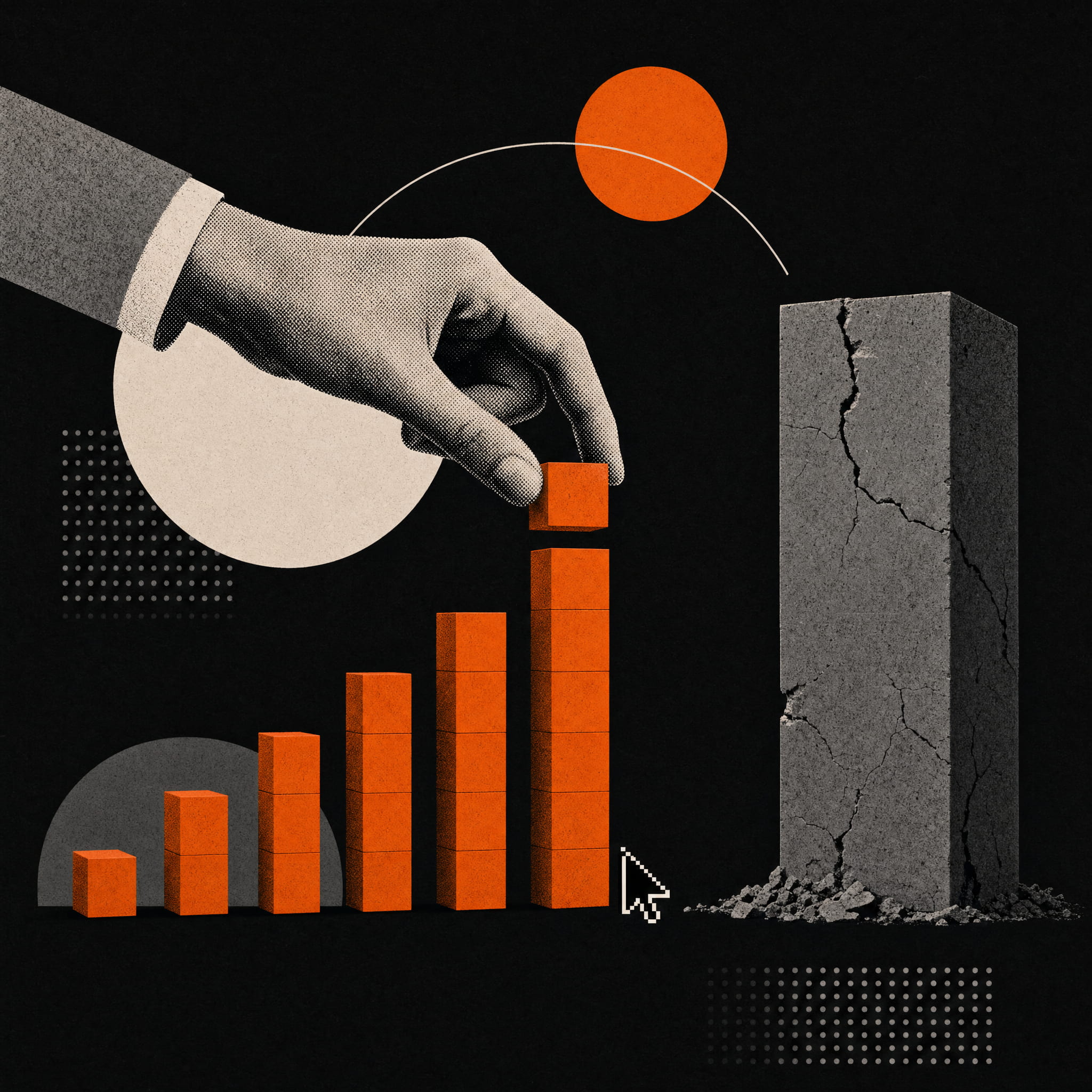
You sign in January. You launch in April. But your business moved in those four months — and the website reflects a version of your company that no longer exists. There's a better way to work.
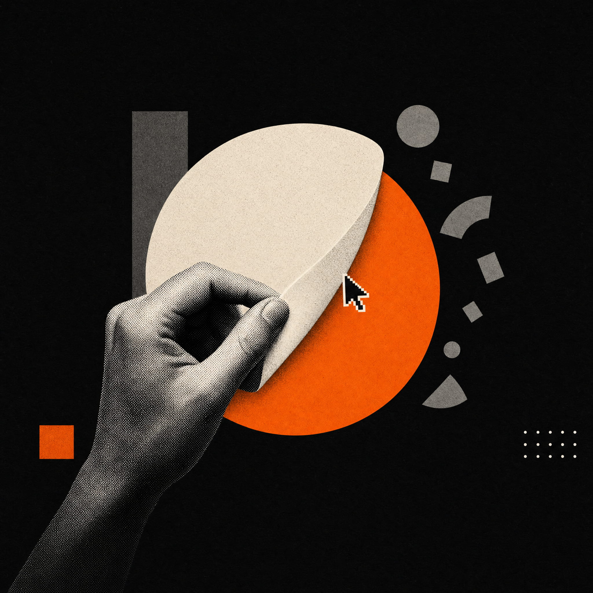
A better brand doesn't always mean better business — at least not immediately. The psychology of familiarity is real, and ignoring it during a rebrand can cost you the users who matter most. Here's what actually happened when Tropicana, Gap, and others found out the hard way.
Motion design isn't decoration. When it's doing real work, it's answering user questions before they reach your support inbox — at zero cost per interaction. Here's the business case most studios don't make.
Your onboarding prototype passed every review. Then real users arrived — and everything changed. Here's why the gap between Figma and reality is structural, not accidental, and how to design for it.
Many SaaS websites follow the same structure, layout, and design patterns. Learn why this happens and how companies can stand out without sacrificing usability.
Users decide whether they trust a website within seconds. Discover the subtle design signals that shape credibility and why some websites feel reliable instantly while others create doubt.
Brandbook and design system are often confused but solve different problems. Learn what each one actually does and when your company needs one or both.
Quick redesigns promise fast results but often create new problems. Learn why cosmetic changes fail and how strategic improvements deliver lasting performance gains.
More features don’t mean better UX. Learn how feature creep increases complexity, hurts usability, and why simpler products attract more users and retain them longer.
A website can look modern and still feel cheap. Subtle design decisions shape how people perceive quality, trust, and value within seconds. This article explores the hidden factors that make a digital experience feel premium or disposable, and how thoughtful design choices quietly influence whether users see your brand as worth paying for.
First impressions decide everything. Learn why users leave websites within seconds, what triggers early drop off, and how clarity, trust, and structure keep visitors engaged.
Visual trends change fast, but brand consistency builds trust over time. Learn why consistent brands outperform trend-driven ones and how to evolve visually without losing identity.
UX writing shapes how users understand, trust, and interact with digital products. This beginner-friendly guide explains what UX writing is, how it differs from copywriting, and why it plays a critical role in modern user experience.

Design trends change fast, but timeless design builds lasting value. Learn why modern aesthetics age quickly and how long term design principles sell longer.